OVERVIEW
Bullet Graph is created by Stephen Few, one of the leader in data visualization. It is a visualization that helps to compare different statistics in a combo bar graph. For example, you want to visualize to know how your calculated YTD compared to last year or the target you set. Or you want to visualize to easily track how good is your balance in range of Poor, Good and Excellent. Below is an examples of Bullet Graph:
- Excel Sample Download
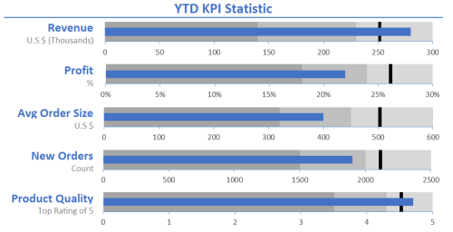
- Horizontal Bullet Graph:
![]()
- Vertical Bullet Graph:
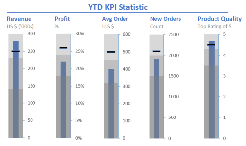
There are two types of bullet graph and two ways to create them:
- Two types:
- Horizontal Bullet Graph
- Vertical Bullet Graph
- Two ways:
- Create each individual bullet graph (like above with each different statistic value and unit)
- Create a dynamic graph for all bullet (all bullet in 1 graph with unit as % of total 100%)
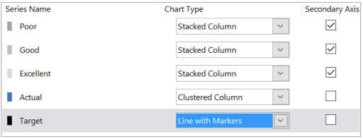
Create each individual bullet graph
![]()
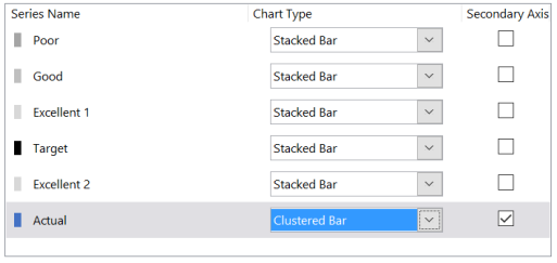
- Concept: Use combo graph with 1 set of stacked bar to present Poor, Good, Excellent and Target on Primary Axes and the other YTD bar on Secondary Axes
- Prepare data: Original Data (1) -> Chart Feeder (2)
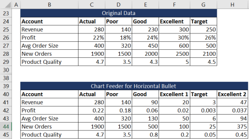
- Keep the Actual column the same because it’s an individual bar on Secondary Axes (C41 = C25 = 280)
- Poor, Good, Excellent 1, Target, Excellent 2 is created to make a stacked bar with formula:
Poor(2) = Poor(1) (D41 = D25 = 140)
Good(2) = Good(1) – Poor (1) (E41 = E25 – D25 = 230 – 140 = 90)
Excellent(2) = Target(1) – Good(1) (F41 = G25 – E25 = 250 – 230 = 20)
Target(2) = 1% * Excellent(1) (G41 = 1% * F25 = 1% * 300 = 3)
Excellent(2) = Excellent (1) – Target(1) – Target (2) (H41 = F25 – G25 – G41 = 47)
- NOTE: Data prepare to create a stacked bar graph like below on Secondary Axe. Target use 1% to create a slim line as target based on range of the bar. Pull formula down for other rows.
![]()
- Create graph: Use combo chart with series from the Chat Feeder just created
- For Vertical Bullet Graph only: You can always use a Line Graph for the Target and choose the marker as a line to represent. In this case, you don’t need to include the Target in the transforming data step (just Poor, Good, Excellent). Your combo chart should look like:
Create dynamic graph for all bullet
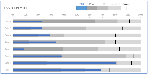
- Concept: Use combo graph with set of 100% stacked bar to present Poor, Good, Excellent and Target on Primary Axes and the other YTD bar as % on Secondary Axes
- Prepare data: Original Data (1) -> Normalized Data (2)
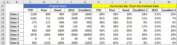
- Calculate each column in (2) as % of Excellent (1)
- YTD, Poor, Good, Excellent 1, 2012, Excellent 2 in (2) is created with formula:
YTD(2) = YTD(1) / Excellent(1) (H23 = C23/G23 = 1100/1600 = 69%)
Poor(2) = Poor(1) / Excellent(1) (I23 = D23/G23 = 600/1600 = 38%)
Good(2) = [Good(1) – Poor (1)] / Excellent(1) (J23 = [E23 – D23]/G23 = 300/1600 = 19%)
Excellent 1(2) = [2012(1) – Good(1)] / Excellent(1) (K23 = F23 – E23 = 300/1600 = 19%)
2012(2) = 0.5% (L23 = 0.5%)
Excellent 2(2) = 1 – Poor(2) – Good(2) – Excellent(2) – 2012(2) (M23 = 1 – I23 – J23 – K23 – L23)
- NOTE: 2012 is last year target. I use 0.5% to create a slim line as target based on range of the bar. Pull formula down for other rows.
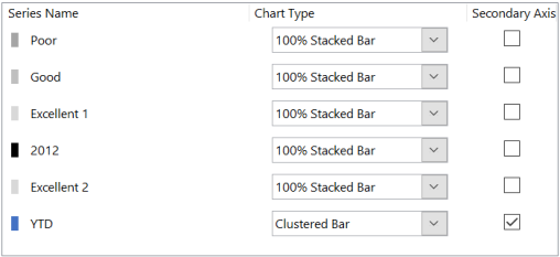
- Create graph: Use combo chart with series from the Normalized Data just created. Each series has multiple data (in this case from Data 1 – Data 8)

- Combo chart with 100% stacked bar for Poor, Good, Excellent 1, 2012 and Excellent 2 on Primary Axe and YTD as % on Secondary Axe
TIPS AND OPINIONS
- Both ways can be applied for both types (change graph style between horizontal bar graph and vertical bar graph).
- Color: Use proper color for each status range: Poor, Good, Excellent (Excellent 1, Excellent 2). In this sample, I use the same color Gray with different transparency (30%, 50%, 70%) or can use high transparency of red, yellow, green (not recommended). For target, I always use Black to highlight and the actual is a bar with color blue to stand out from other statistics.
- Create individual: Should use when you have different statistics with different Unit ($, #, Count, %). After create 1, you can copy the design and change the data for each bullet.
- Create dynamic: Should use when you have same unit statistics or can be viewed in %.
REFERENCES:
-
Few, S. (2013). Information dashboard design: Displaying data for at-a-glance monitoring. 2nd edition. Burlingame, CA: Analytics Press.
-
Using Pivot Charts. (2011). Alexander/Excel Excel® Dashboards & Reports, 221-244. Retrieved from
